Digio: Our rebranding
Image
After a track record that dates back to 2007, at Digio we have decided to undertake a complete brand redesign with the aim of acquiring our own, completely differentiated narrative and visual language, in line with our values, capabilities, and relevance in the sector.
What have we worked on?
Strategy
Narrative
Brand identity
Visual language
Digital
The Challenge
Over the past 17 years, Digio has differentiated itself by its capacity and quality in creating digital platforms and products in a wide variety of verticals and technologies. We have been pioneers in the adoption of multiple technologies and paradigms, from mobile development, which we have tackled since its inception, to generative artificial intelligence, IoT and fintech.
Therefore it became necessary to address the creation of a new brand that, while maintaining our distinctive name, would merge our extensive experience with a comprehensive approach to the creation of digital solutions. Through this process we aimed to build a visual identity and a narrative that would match our performance and capabilities.
In order to achieve this challenge, we decided that it was essential to work with a leading branding company, so we trusted MUCHO, one of the most reputable agencies in the world, which has created incredible projects and brands for companies as relevant as Visa, Apple, Paypal or Movistar.
The strategy
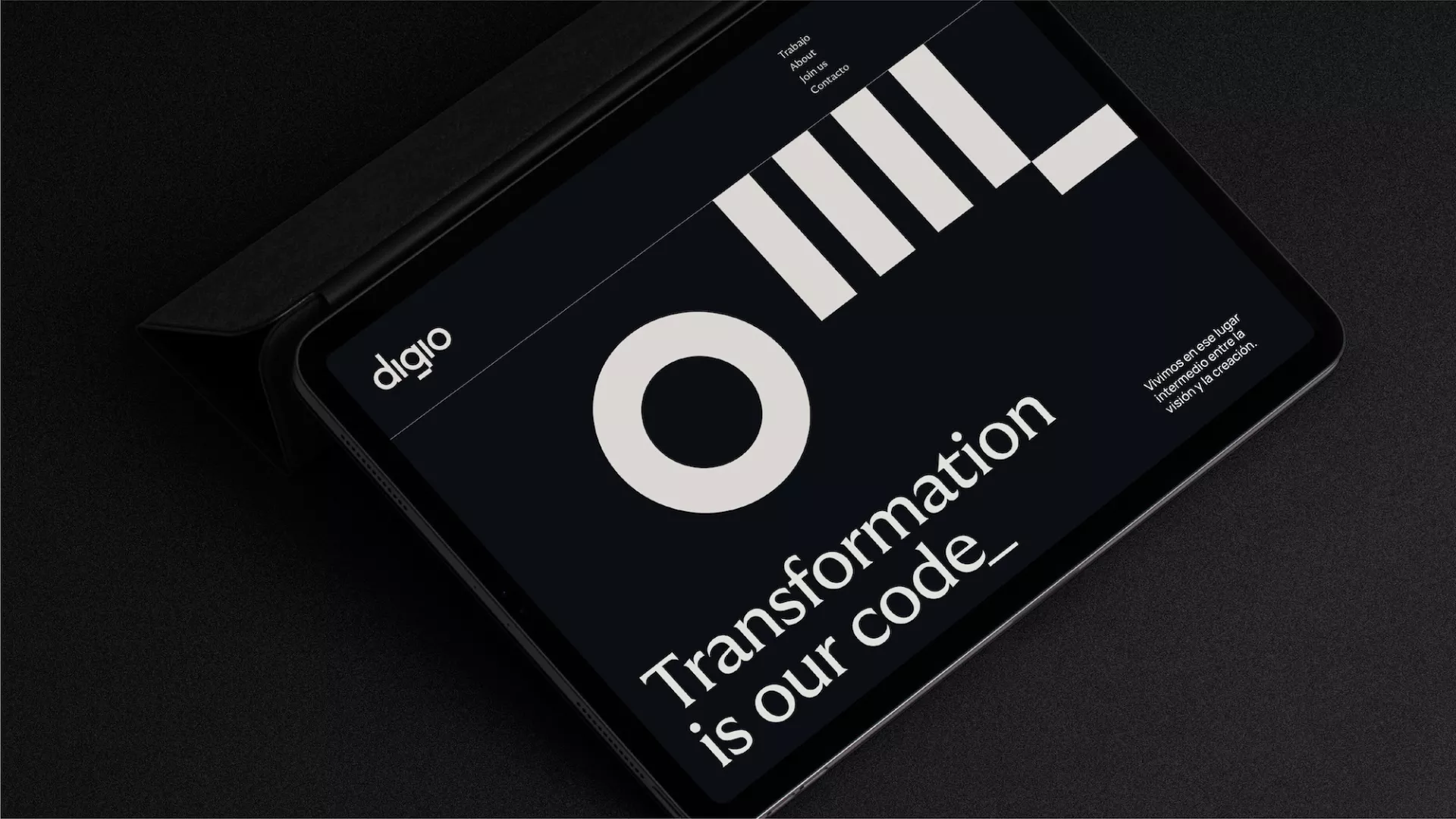
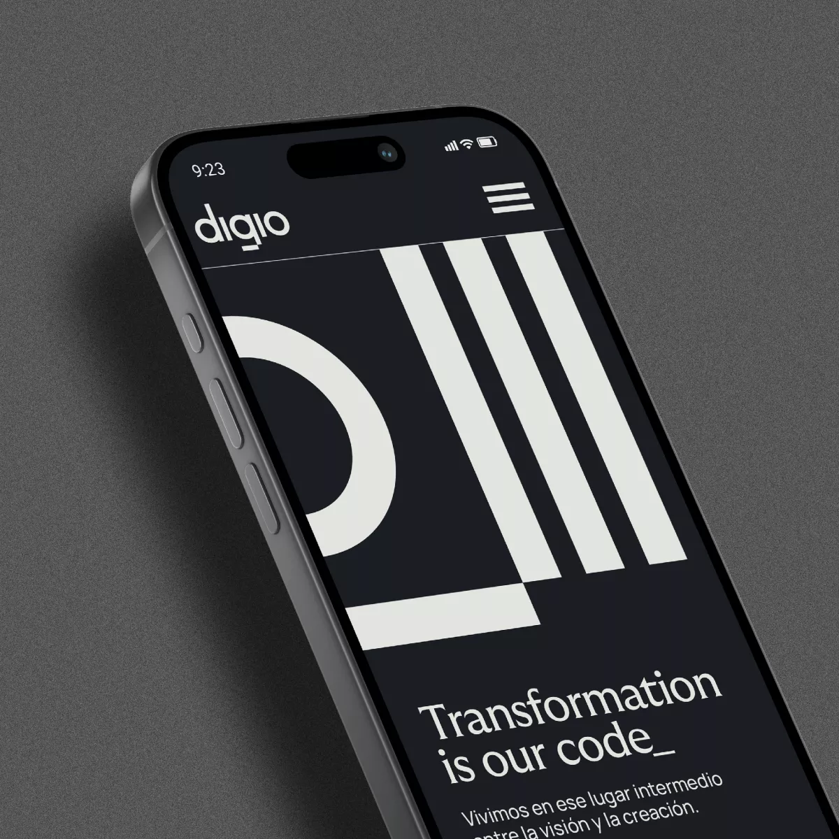
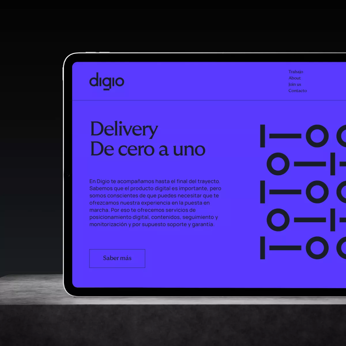
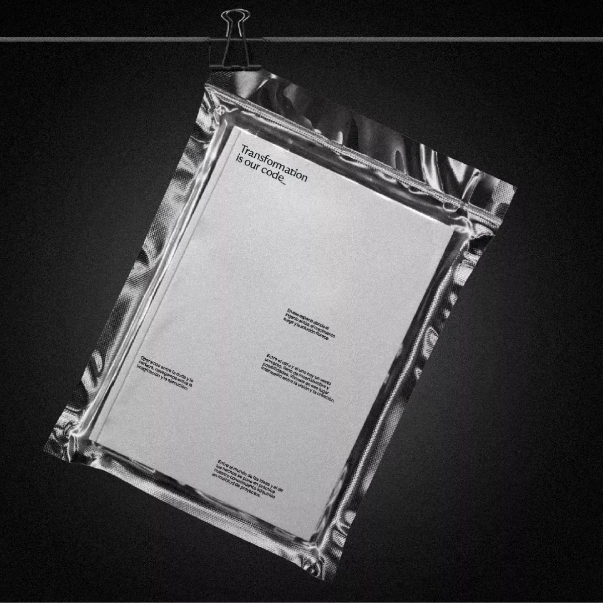
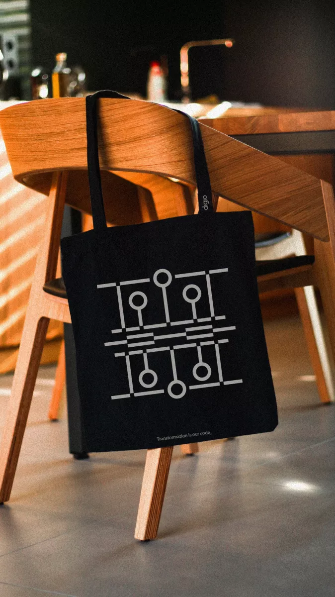
The combination of our team's expertise and the pursuit of impactful and transformative solutions for our customers, set "Transformation" as the cornerstone of our narrative. This balance has crystallised in the tagline "Transformation is our code_", reflecting our commitment to driving change in every digital challenge we address. The use of the word "code_", in its dual reference to software development and code of conduct, allowed us to establish an open and distinctive message.
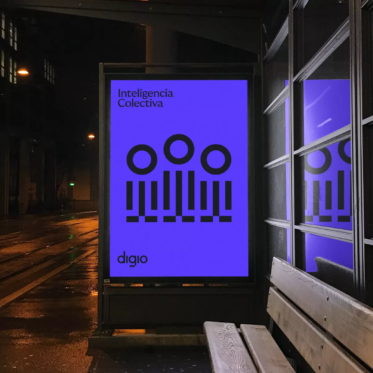
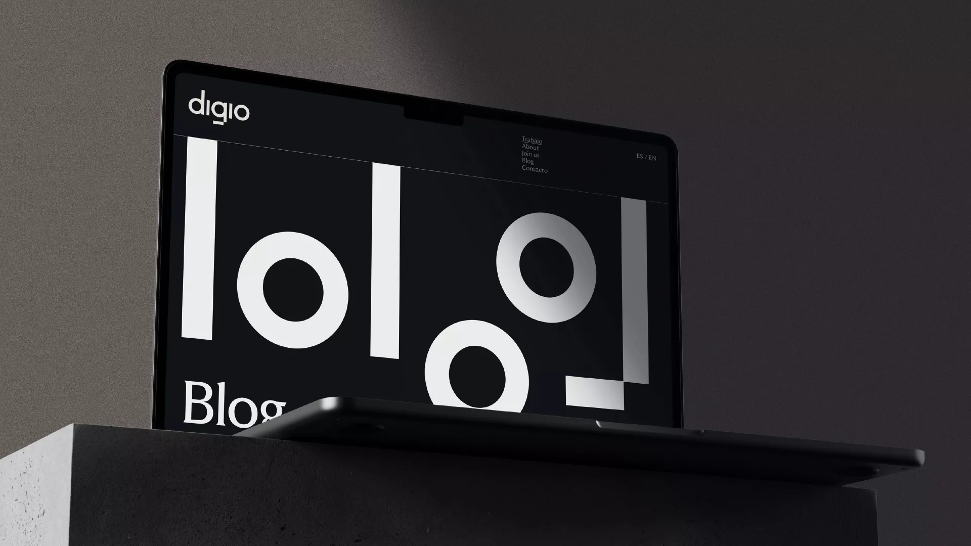
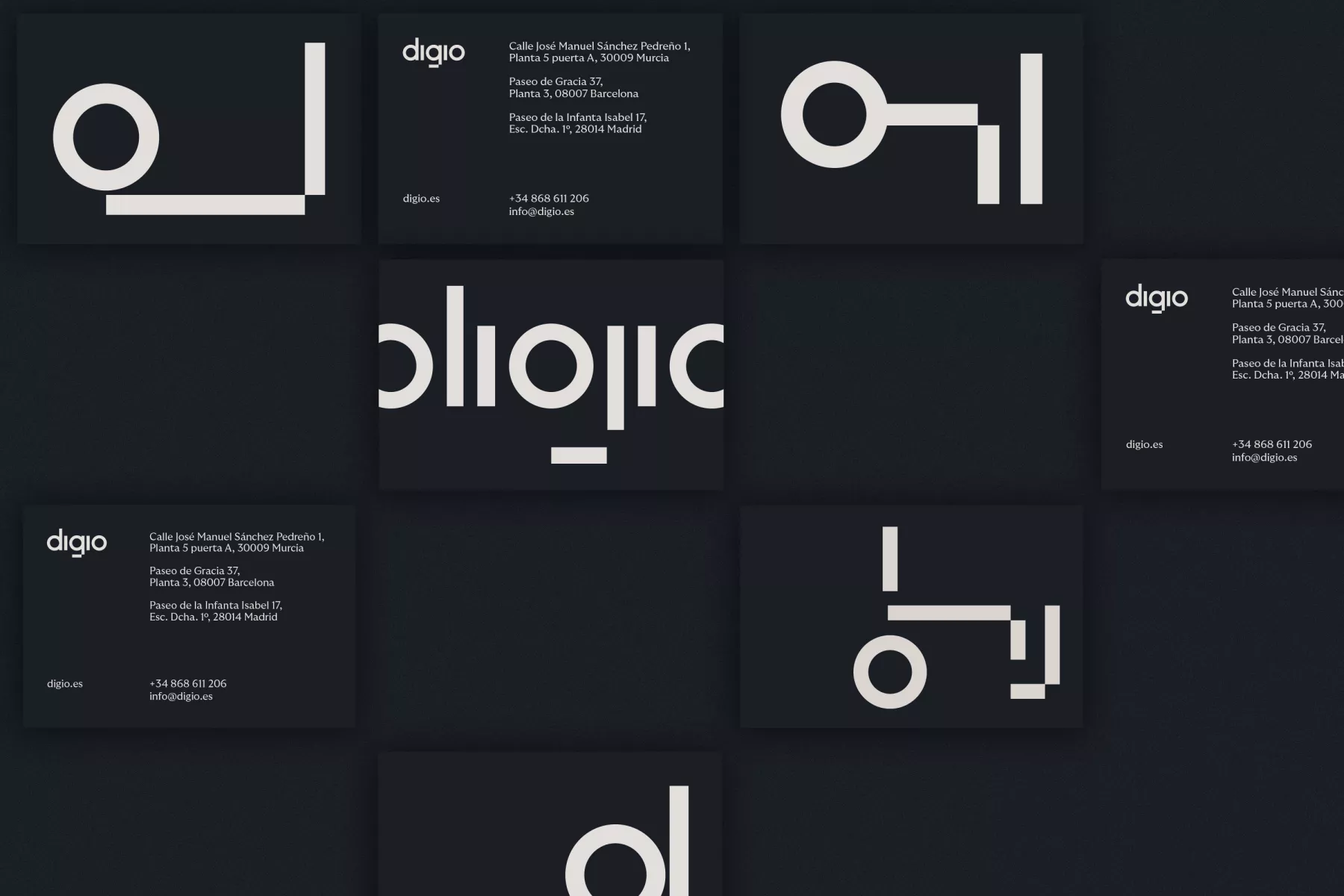
At the same time, we reclaimed the symbolic meaning of the binary digits that make up our name (Dig10), and used them as inspiration for the visual identity and brand narrative thereby reflecting Digio's contribution as that which lies between zero and one; a universe full of uncertainty, but also of possibilities that we’ve managed to realise.
The solution
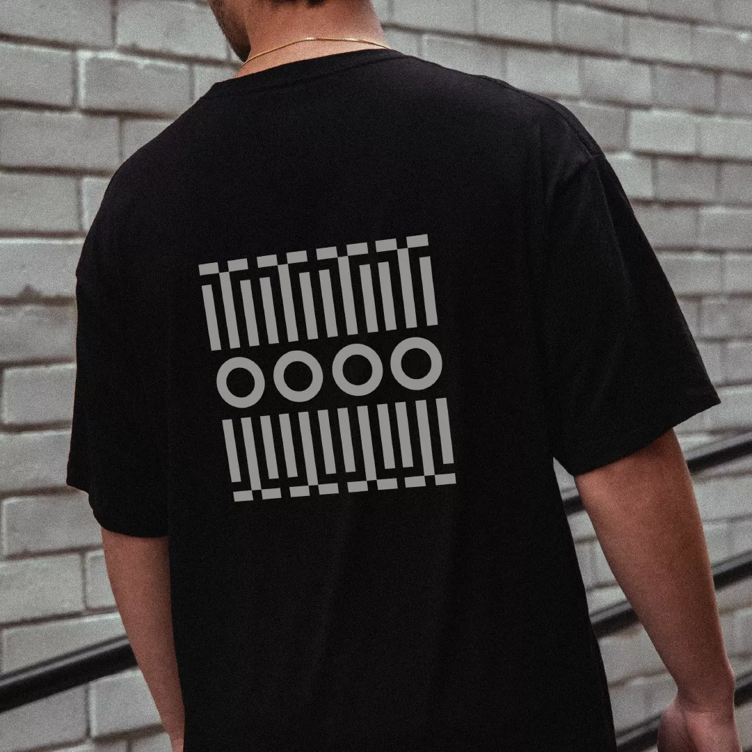
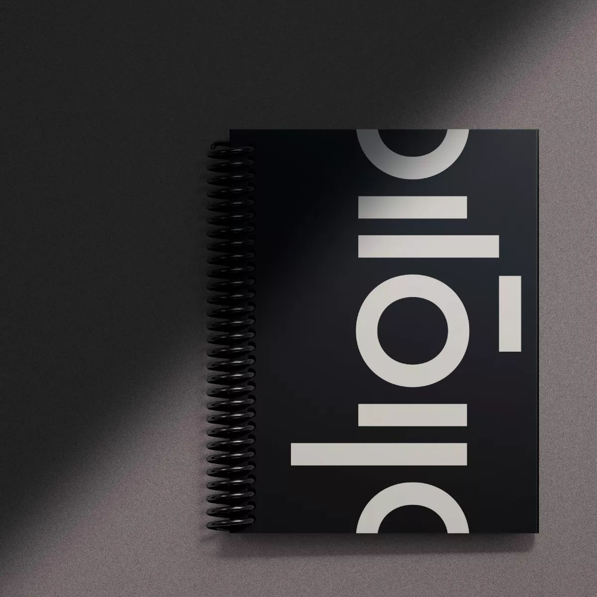
Both the logo and the visual language play with the concept of transformation and binary code in a variety of ways.
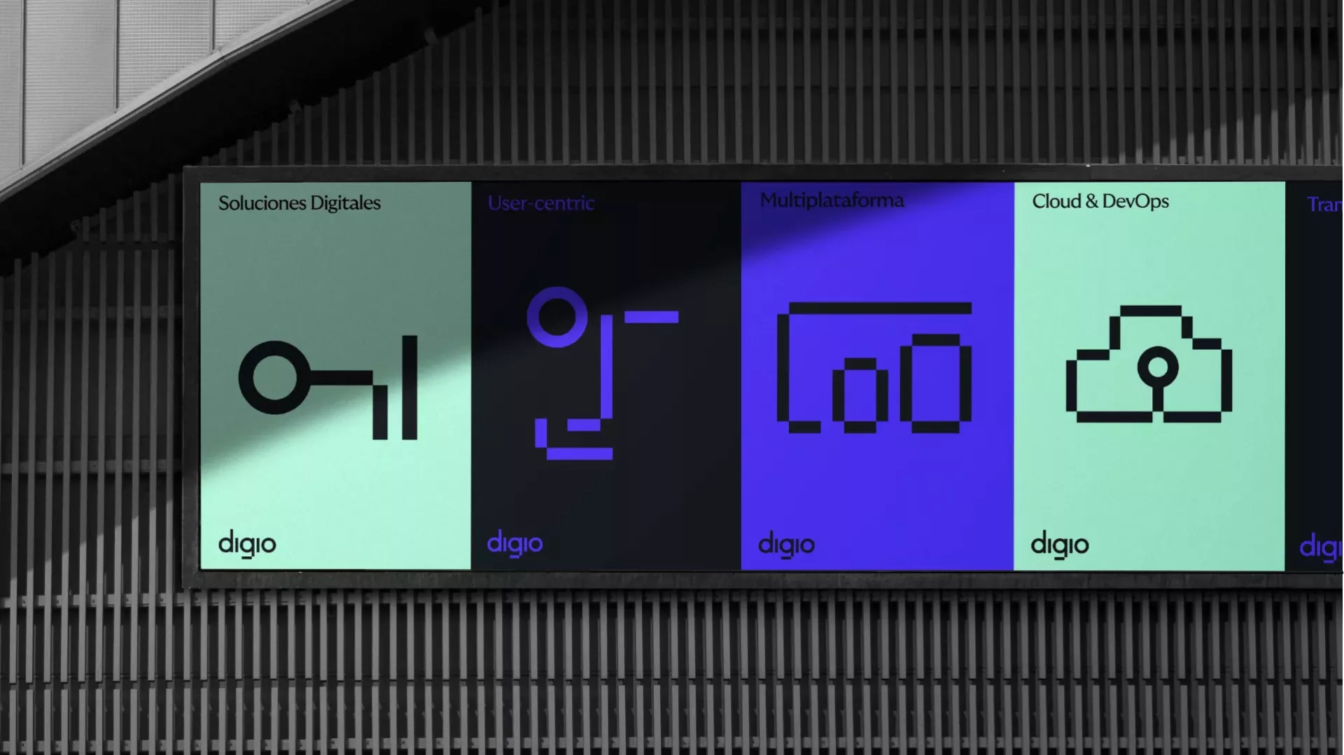
From a set of icons created solely from zeros and ones, to stretching the symbol and creating an extended visual language, the brand breathes a digital essence through all of its touch points.
The combination of our team’s technical expertise and our pursuit of impactful solutions for our clients’ businesses has set “Transformation” as the cornerstone of our narrative. Transformation is our code_ expresses our commitment to driving change as a shared goal for every digital challenge we face.
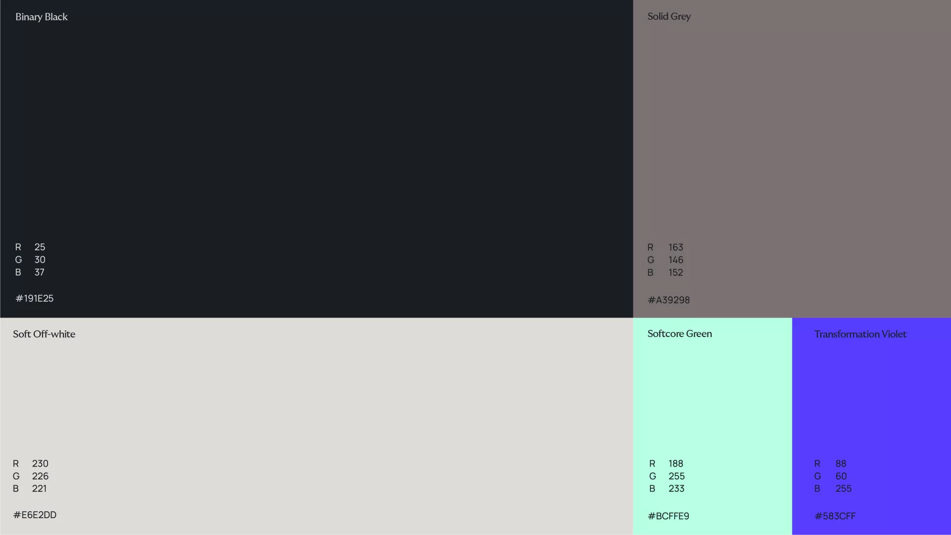
The color palette chosen uses black and white as the main colors and grey as an intermediate tone. On a second hierarchy level, a soft green and a violet were chosen to embrace Digio’s digital nature.
The symbol is a synthesis of the binary code concept. Digio lives in the space between these two figures, full of uncertainty and possibilities. In that intermediate space between vision and creation. Between non-existence and existence.
The icon system reinforces further this idea while taking it a step beyond. The creation of a versatile icon library based on ones and zeros was the first step of the development of a thorough visual language.
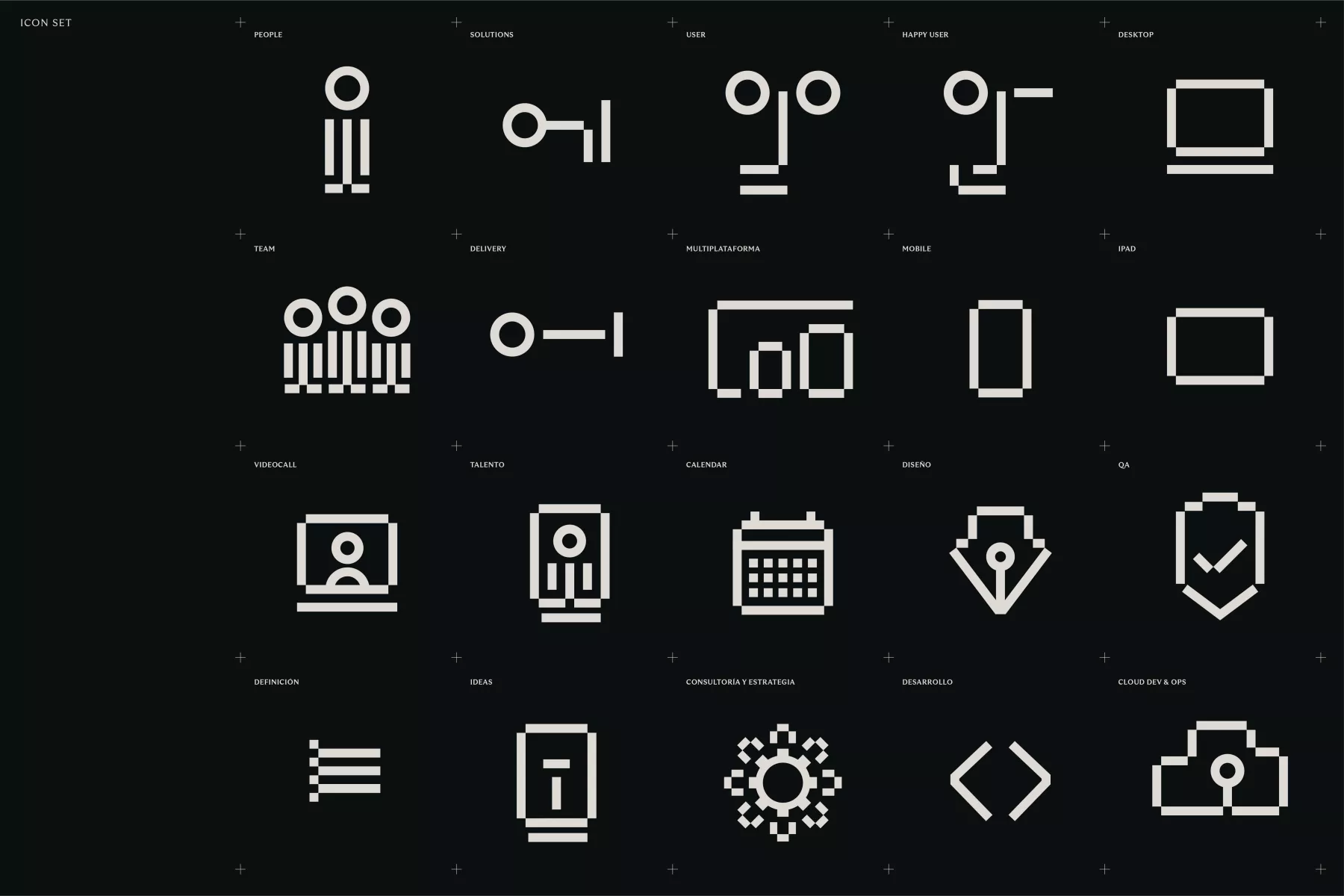
Based on the company’s values, the visual language stretches itself to create an easy and comprehensive system that gives a cohesive look that goes from solid to flexible at the blink of an eye.

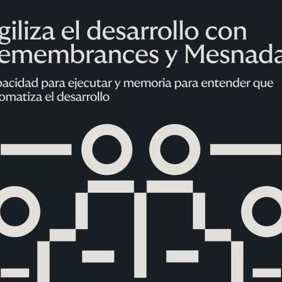
Capacidad para ejecutar y memoria para entender: Mesnada y Remembrances. Ya disponibles.
Add advanced functionality to your software quickly.
Discover our IoT platform for monitoring spaces.